
I was motivated to write this blog after a client said to me “picking a paint color is more difficult than picking a child’s name”. So funny and how true that can be.
Selecting paint colors can prove to be more difficult than finding the perfect fabric or piece of furniture. With a vast array of palettes and the effect that light has on wall color, what you think is the ideal white will look yellow or that grey you matched to a fabric has a hint of red or the most common, that off-white/neutral looks peachy.
So today I am sharing my guide on sampling color and my “go-to” list of the perfect shades.
- Generally I select paint colors not first or last, but in conjunction with the design of the room or full house remodel. I usually know going in if I want to envelop the room in a dark color or go light.
- My favorite and most often used palette comes from Benjamin Moore. They offer a great product and a seemingly endless selection of hues that can even be customized.
- Once I have an idea of the colors I want to sample, we paint large swatches in the room but not just in one spot! I recommend painting 2-3 large squares on a white base or up against white trim. So often I see people selecting a color they end up not liking because it was affected by the base color or surrounding colors.
- A simple rule of thumb when it comes to straight forward paint sheens:
- Walls/ceiling = matte
- Trim = semi-gloss
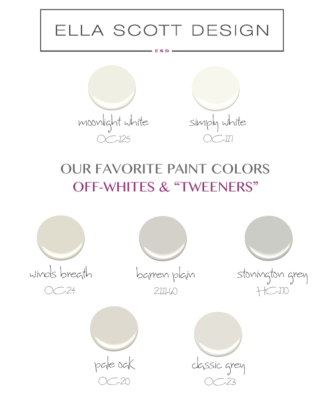
THE PERFECT PAINT PALETTE:
Whites – Painters who I use always tease me when I say “paint it white” – Moonlight or Simply White is all they ask, because I never stray and this is why:
RICH OFF-WHITES
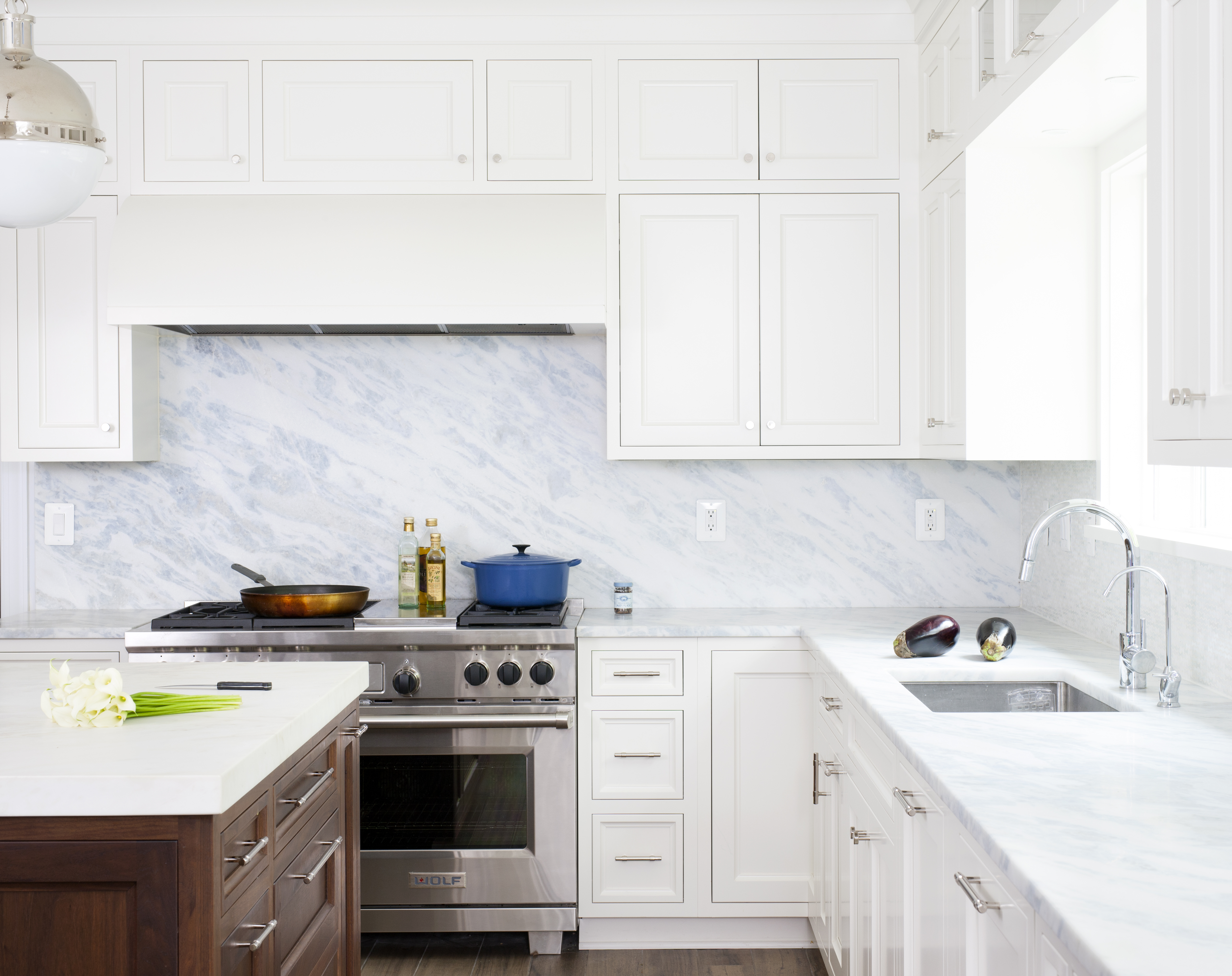
Moonlight White | OC-125 : This is not a straightforward bright white, but when used by itself that’s what it looks like. It has a wonderful warmth but still feels like a crisp white. I would recommend using Moonlight White when painting an entire room white. You can literally never go wrong! And just to make things super easy and really beautiful, paint everything that color. Walls, trim and ceiling – don’t bother changing your white when you are painting in the same room.
Moonlight White | OC-125: Ceiling (matte) + Cabinet & Trim (semi-gloss)
Moonlight White | OC-125: Ceiling (matte) + Trim (semi-gloss)
Simply White | OC-117: This is a really crisp bright white. It is so clean and it is straightforward. If you love bright white then this is your color. It is beautiful and unbeknownst to me it is color of the year!
Simply White | OC-117 : Walls (matte), Trim (semi-gloss)
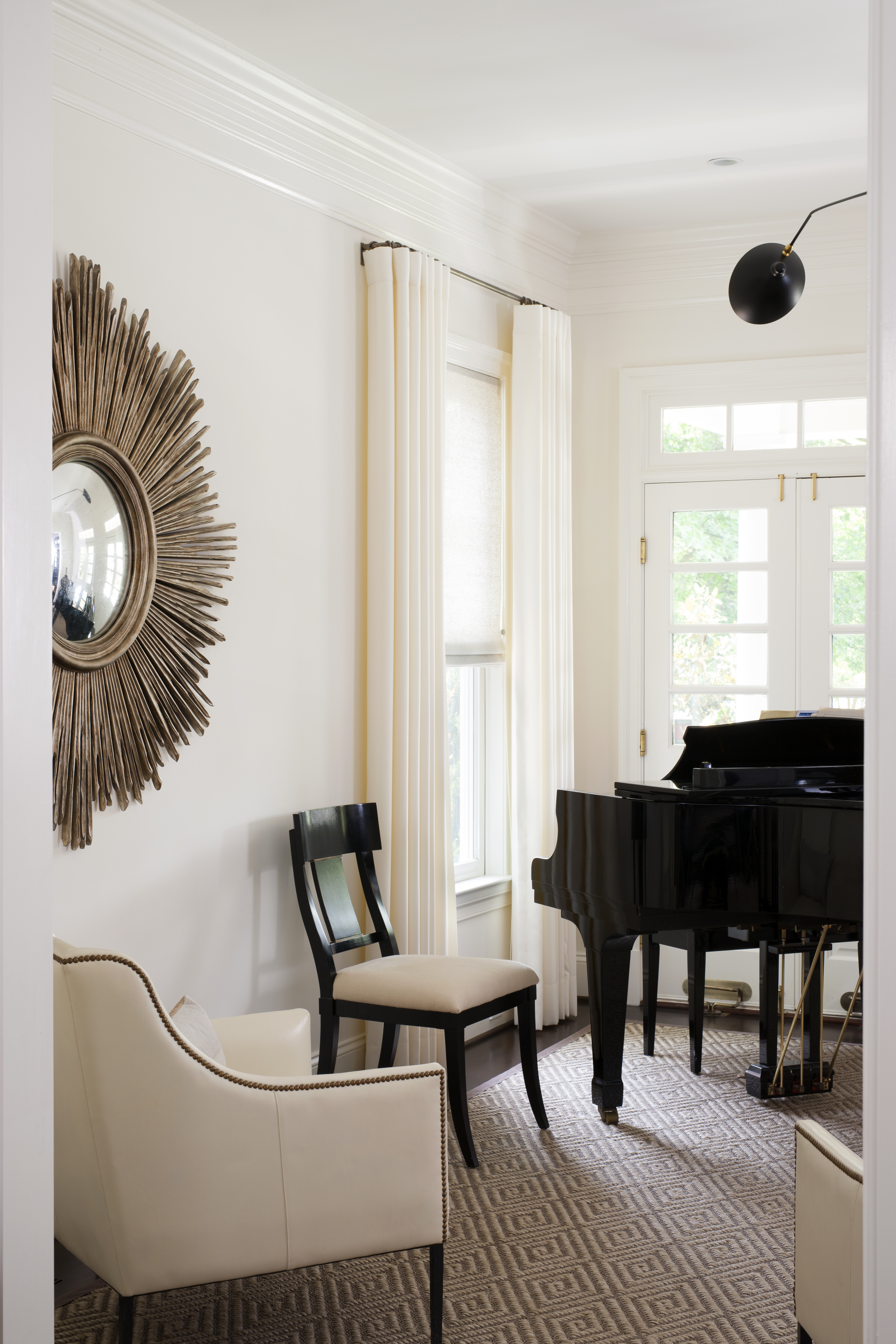
Can we break from paint for just a second to talk about this chair…amazing!
“TWEENER” COLORS
I think we can safely say that we coined the phrase “tweener”. In our office, this refers to those paint colors that you never know which way they are going (warm or cool) until you get them in the room, but them seem to work with everything. The colors are not exactly grey or beige, just neutral pretty colors.
Winds Breath | OC-24 : More neutral in color (not a grey), seemingly a beige/off white but doesn’t bend yellow or pink. It’s simply warm and so straightforward of a color. I have used it so many times and it’s always consistent.
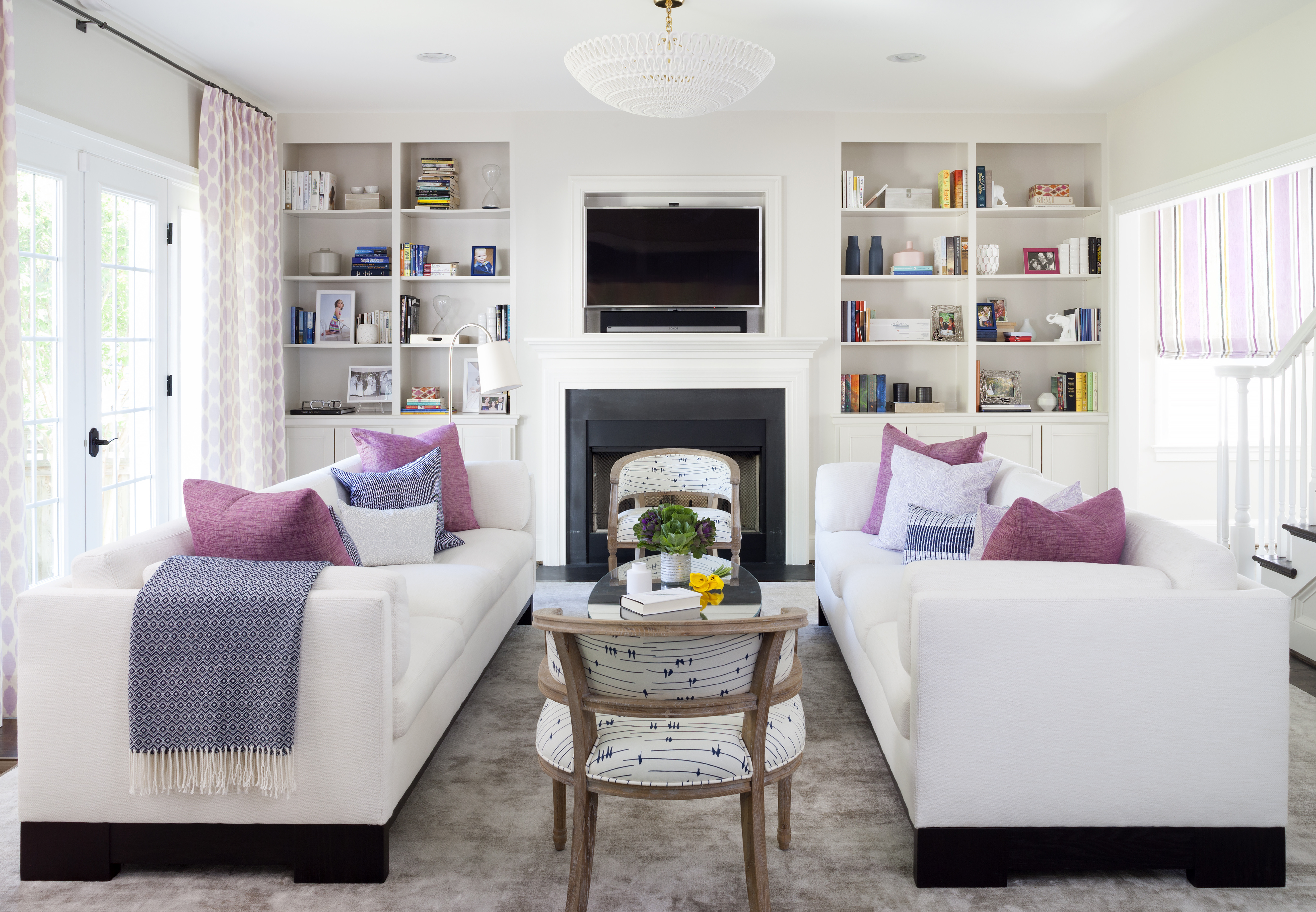
Winds Breath | OC-24 : Walls (matte), Bookshelves (semi-gloss) + trim Moulding (semi-gloss) simply white
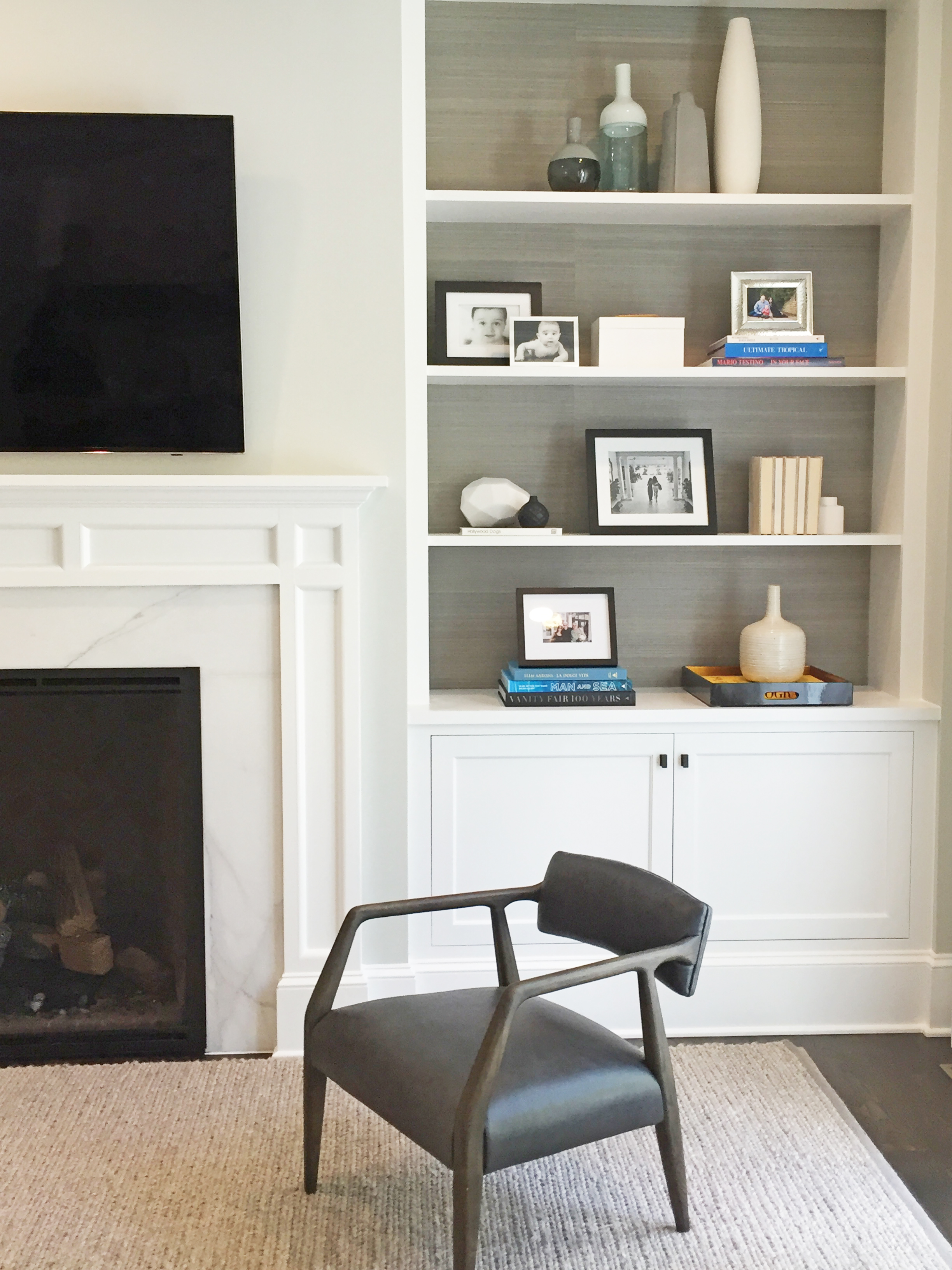
Barren Plain | 2111-60 : This color bends more grey (as you can see below) but its a neutral grey. I have also put this color in entryways and you would never walk in and think this is grey.
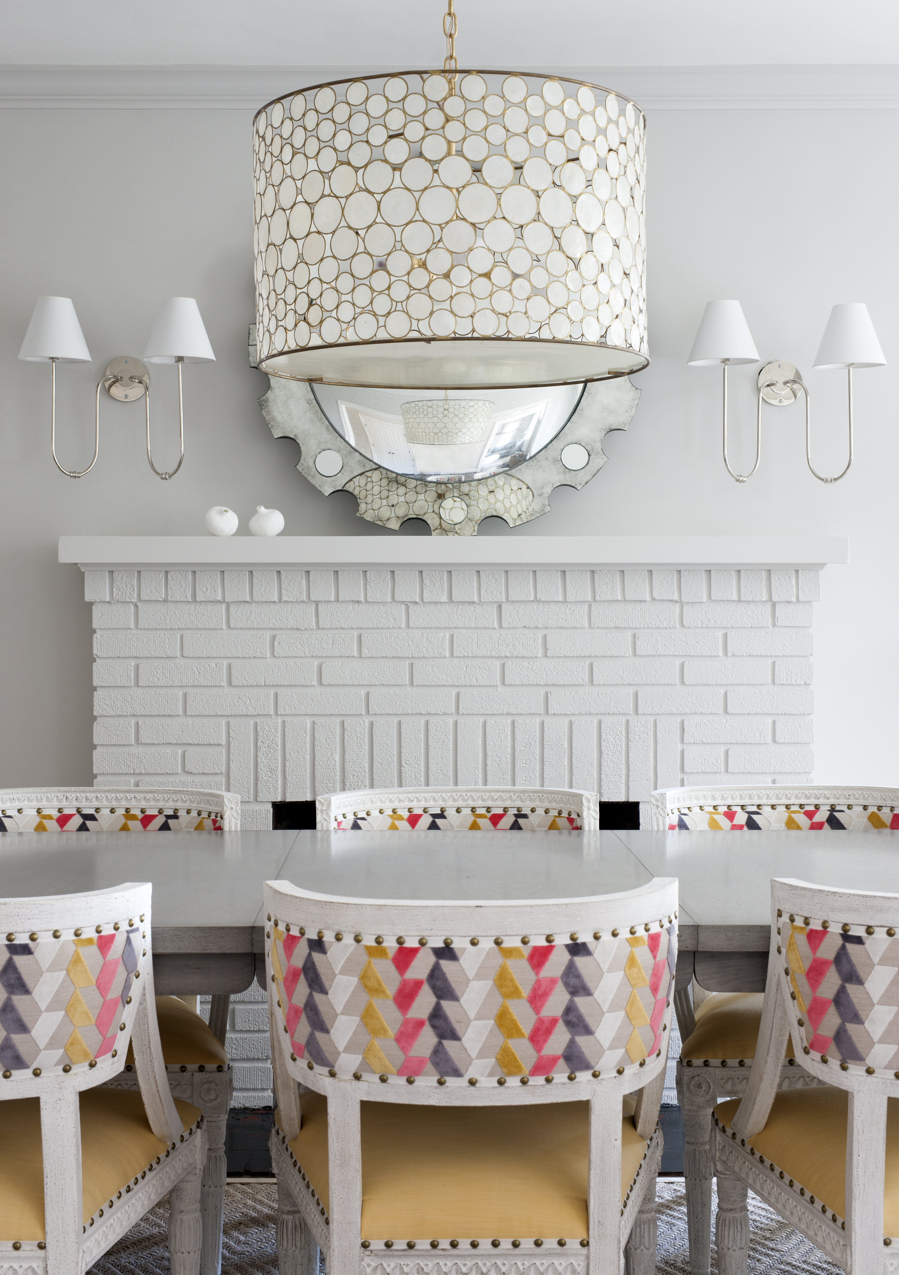
Barren Plain | 2111-60: Walls (matte), Trim + Fireplace (semi-gloss)
Stonington Grey | HC-170 : This is a true gray but so nice…not cold or industrial. It bends slightly blue when paired with certain things.
Stonington Grey | HC-170 : Trim (semi-gloss)
Pale Oak | OC-20 : I love, love, love this color! I have used it in every way possible. In a bedroom as the trim and ceiling (with wallpapered walls) and then on trim and ceiling in my daughters room where the walls are painted a few shades down, Seapearl OC-19 matte. and most recently I have used it in clients living room (not shown as it is not yet complete). It is a rich and warm neutral. It has soul.
Pale Oak | OC-20 : Ceiling (matte) and Trim (semi-gloss)
Pale Oak | OC-20 : Ceiling (matte) and Trim (semi-gloss); Walls (Seapearl OC-19 | matte)
Classic Grey | OC-23 : This color offers a really light light hint of grey. This is the perfect grey white without being cold.
Classic Grey | OC-23 : Walls (matte)
Recent Comments